\"Angry Kirby\" Explained by Former Nintendo Employees
- By Julian
- Feb 15,2025
Unlocking the Mystery of "Angry Kirby": A Look at Nintendo's Localization Strategies

This article explores the evolution of Kirby's image in Western markets, specifically addressing the "Angry Kirby" phenomenon and Nintendo's evolving localization approach. Former Nintendo employees shed light on the decisions behind the differing portrayals of the iconic pink puffball.
The "Angry" Kirby: A Strategic Shift
Kirby's Western depiction often featured a more determined, even "angry," expression on game covers and promotional materials. Former Nintendo Localization Director, Leslie Swan, clarifies that the goal wasn't to portray anger, but rather a stronger sense of resolve. While cute characters resonate broadly in Japan, Swan notes a preference for tougher characters among American tween and teen boys. This aligns with comments from Kirby: Triple Deluxe Director, Shinya Kumazaki, who acknowledges the appeal of a "strong, tough Kirby" in the US market, contrasting with the cuteness that drives Japanese engagement.
Marketing Kirby: Beyond "Kiddie"

Nintendo's marketing strategy aimed to broaden Kirby's appeal, particularly among boys. The "Super Tuff Pink Puff" tagline for Kirby Super Star Ultra (2008) exemplifies this shift. Former Nintendo of America Public Relations Manager, Krysta Yang, highlights Nintendo's desire to shed its "kiddie" image, acknowledging the perceived negative impact of such a label. This led to a focus on Kirby's combat abilities in marketing, aiming to attract a more mature audience. While recent years have seen a more balanced portrayal of Kirby's personality, the "cute" aspect remains dominant in public perception.
Regional Variations in Localization
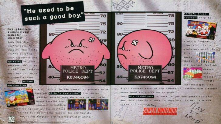
The divergence in Kirby's image between Japan and the US began early. A 1995 "Play It Loud" advertisement featuring a mugshot-style Kirby is a prime example. Subsequent game box art often showcased Kirby with sharper features and more intense expressions. Even Kirby's color was altered; the original Game Boy release of Kirby's Dream Land (1992) featured a desaturated Kirby, a decision influenced by the Game Boy's monochrome display. This early alteration, coupled with the perceived need to appeal to a broader Western audience, contributed to the evolution of Kirby's image.
A More Globalized Approach
Both Swan and Yang concur that Nintendo's approach has become more globalized. Closer collaboration between Nintendo of America and its Japanese counterpart has led to more consistent marketing and localization strategies. Regional variations, such as the differing Kirby box art, are less common now. While this consistency benefits brand recognition, Yang acknowledges a potential drawback: a homogenization that might lead to less distinctive, risk-averse marketing. The shift is also partly attributed to the increasing global awareness of Japanese culture and the blurring lines between regional tastes.
Latest News
more >-
-

-

-

-
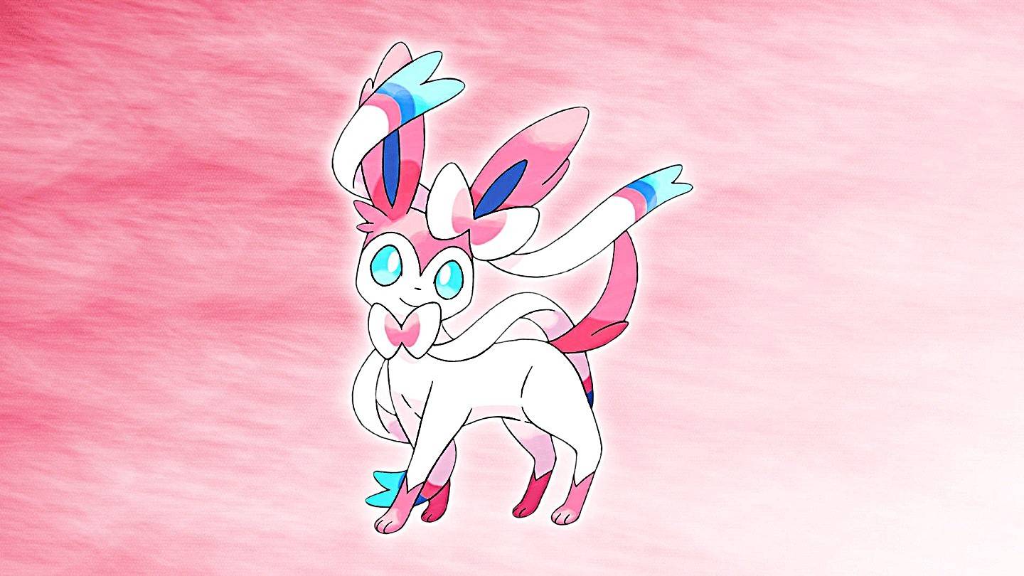
- Top 50 Pokémon: Sweetest Companions Revealed
- Feb 20,2025
Top News
-

Emoak launches its latest casual puzzle game, now available on mobile platforms
-

No Snooze? You Lose! SF6 Tournament “Sleep Fighter” Requires You to Rest
-

Stumble Guys joins hands with My Hero Academia, heroic adventures are waiting for you!
-
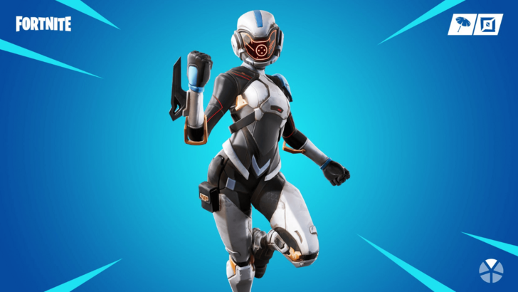
Fortnite Re-Releases Paradigm Skin By Accident, Lets Players Keep It Anyways